Instagram, the photo and video sharing powerhouse, is pushing forward with yet another redesign aimed at enhancing the user’s profile experience. This time, the focus is on the layout and accessibility of Story highlights—a feature that has become synonymous with the platform. With social media strategist Lindsey Gamble recently sharing insights from inside the company, we have learned of a significant change concerning how users will interact with their digital memoirs. So, what does this mean for Instagram aficionados and casual users alike?
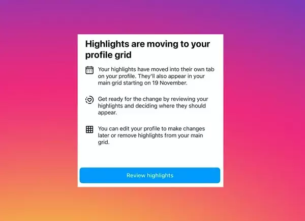
As per the latest announcement, Instagram will be relocating the Story highlights bubbles from their current position above the profile grid and introducing a designated tab in user profiles. This tab promises a more organized approach, aiming to simplify user navigation while still allowing highlights to be visible in the main feed. The move to a dedicated section may appear to enhance user experience, yet it also raises questions about visibility and engagement with Story highlights moving forward.
The introduction of a rounded heart icon will signify this new tab, serving as a visual cue for users to explore their highlights more seamlessly. Within this tab, individual Story thumbnails will be arranged vertically by topic, offering an aesthetic change in design and functionality. According to Adam Mosseri, Instagram’s chief, the motivation behind these adjustments is clear: “We’re trying to figure out a way to improve the profile and get more of the content above the fold, and simplify it…” This mission statement hints at a larger goal of streamlining the display without overwhelming users while still providing essential control.
What Implications Does This Have for Engagement?
Despite the intent behind this new format, the implications for user engagement and interaction with highlights remain debatable. While moving highlights to a dedicated tab appears cleaner and more organized, one cannot ignore the potential hazard of reduced viewer interaction as highlights become less prominent. Users frequently seek a quick glance through highlights as they browse the feeds of their acquaintances, but with less visibility in the main grid, it’s plausible that fewer users will take the time to engage with these highlights.
Moreover, the concern arises that Story highlights may have already lived their lifespan as users increasingly prioritize real-time interactions. Perhaps there is an understanding among Instagram users that Stories—in essence, fleeting moments—are not meant to be revisited. Instagram’s decision to reposition highlights could suggest that the platform’s leadership acknowledges this sentiment while hoping to drive engagement through better organization.
Mosseri’s commentary introduces an interesting debate about social media design philosophy. The mention of “pogs” in his explanation suggests a dynamic approach to understanding visual clutter in digital spaces, illuminating how design can shape user behavior expectations. Simplifying capabilities on a platform as complex as Instagram can serve as both a blessing and a curse; while users may appreciate fewer distractions, an overly simplified layout risks making some features less accessible or even redundant.
The success of this transition will largely depend on user adaptation. Will Instagram’s community embrace this change, or will it become another flashpoint of criticism against what they perceive as unnecessary alterations? Historical patterns suggest that social media users can be resistant to change, especially when it involves how they share and present their lives.
As Instagram proceeds with these changes, anticipation builds among users and industry analysts alike. The update is reportedly rolling out imminently, but conclusive feedback from the community remains to be seen. Will these modifications garner favorable reception and engagement numbers, or will they push users further away from interacting with highlights?
Instagram has promised further details to clarify the roll-out process, but for now, users are left to ponder how their Story highlights will coexist in this new tab alongside their vibrant photo galleries. Ultimately, the evolving interface could redefine how moments are showcased on the platform, testing the balance between aesthetics, functionality, and user preference in the world of social media. Whether this will be a step forward or a stumble backward, only time will tell.


Leave a Reply