
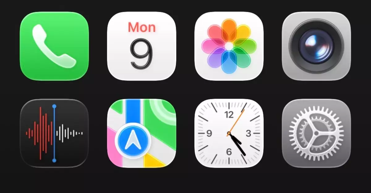
In a bold move that has generated both excitement and skepticism, Apple has unveiled its latest design language known as Liquid Glass during the WWDC 2025. This innovative aesthetic is meant to infuse a fresh fluidity into the user interface, marked by a shimmering and translucent look that engulfs many elements of the iOS experience. As a technology enthusiast with a keen eye for design, it’s fascinating to delve into how this aesthetic shift affects user interaction and overall functionality.
I found myself captivated yet conflicted after spending an extensive afternoon analyzing Apple’s new iteration. On one hand, there is a certain allure to the visuals. The idea of app icons and navigational elements appearing to float above the wallpaper is undeniably modern and artistically intriguing. However, this very fluidity may also transform the user experience in ways that might not be immediately cherished.
A Reflection of Nature or a Design Dilemma?
The liquid and glassy essence that permeates the iOS 26 developer beta offers an innovative interpretation of Apple’s longstanding aesthetic. Yet, I can’t help but critique some of its execution. For an interface that boasts transparency, the overwhelming lightness creates an environment that could quickly veer toward confusion, especially for seasoned users accustomed to more solid designs. Upon first glance, the elements come off as jarringly unfamiliar.
For instance, the Control Center appears cluttered, and the transparency muddles the readability of essential functions. In my initial experience, the visual information seemed scattered, calling for a more opaque backdrop that could alleviate this chaos. It’s clear that while creativity fuels the design, functionality ought to remain paramount. Apple has long been revered for merging form with function; thus, one can’t help but wonder if this shift nudges the brand away from that duality.
Shifting Perspectives: From Skepticism to Acceptance
Despite initial discontent with these changes, I find myself slowly warming to Liquid Glass. My instincts tell me that this shift requires a recalibration of how I engage with my device. Learning curve or not, my overall device interaction retains its foundation—I still navigate with ease, albeit with a few more visual distractions than I would prefer.
Some aspects of Liquid Glass do merit praise. Elements like rounded tab bars and the dynamic animations when interacting with them—such as the droplet effect when selecting different tabs—carry an innovative charm that showcases Apple’s tight-knit engineering and design prowess. This meaningful attention to detail reflects Apple’s commitment to enhancing user experience, albeit with the understanding that not every feature will resonate immediately.
The App Ecosystem: Navigating a New Terrain
As a user who values the usability of apps, I found it intriguing to evaluate how individual applications adapt to this revolution. The iOS keyboard, with its revamped appearance, stands out as a significant shift, but the spacing issues within various settings categories raises concerns regarding clarity and accessibility. Ideally, each application should maintain its intended usability while harmonizing with this ambitious aesthetic, but early signs indicate room for improvement.
The Liquid Glass design does extend to the Safari web browser, where URLs bend under its influence. While this may seem like a neat trick, does it genuinely enhance functionality, or merely exist as a visual gimmick? I tend to argue that any new feature must serve clear purpose beyond offering a visual spectacle.
In moments of reflection, I find myself pondering whether Liquid Glass is a harbinger of Apple’s future design ethos or simply a bold experiment set to be refined in upcoming iterations. It’s essential for Apple to consider user feedback, demonstrating that their designs both captivate visually while upholding the essence of usability. Creativity has its place in tech, but practicality must stand alongside it to ensure that end users are not left navigating a beautifully intricate, yet perplexing, interface.
Leave a Reply